
Usually in each data table there is a column with buttons – Edit, Show, Delete. But often, visually, it’s more appealing to “hide” them and just show an icon (like three vertical dots) and show those actions only by clicking on that icon. How to implement this in Laravel, and more specifically in QuickAdminPanel?
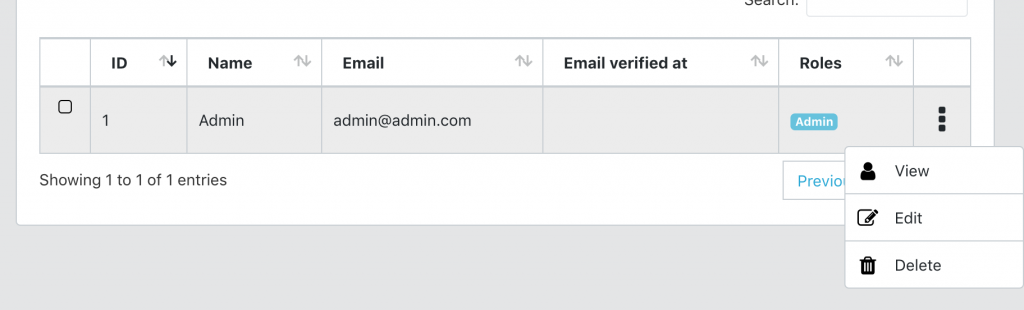
What am I talking about here?
Here is a visual explanation.
BEFORE
AFTER
Now how to replace these buttons with this icon + dropdown?
Generally it’s a JavaScript tweak, not much on Laravel. But I will base this article on a Laravel project generated by our QuickAdminPanel.
In our system, you can have two types of data tables: “regular” and AJAX-based. So we will cover these two cases.
Case 1. With “simple” non-AJAX data tables
Here is a regular piece of code in resources/views/admin/users/index.blade.php:
<td>
    @can('user_show')
        <a class="btn btn-xs btn-primary" href=" route("admin.users.show', $user->id) }}">
            {{ trans('global.view') }}
    @endcan

    @can('user_edit')
        <a class="btn btn-xs btn-info" href=" route("admin.users.edit', $user->id) }}">
            {{ trans('global.edit') }}
        </a>
    @endcan

    @can('user_delete')
        <form action=" route("admin.users.destroy', $user->id) }}" method="POST" onsubmit="return confirm('{{ trans('global.areYouSure') }}');" style="display: inline-block;">
            <input type="hidden" name="_method" value="DELETE">
            <input type="hidden" name="_token" value="{{ csrf_token() }}">
            <input type="submit" class="btn btn-xs btn-danger" value="{{ trans('global.delete') }}">
        </form>
    @endcan
</td>
So a simple list of links/buttons, restricted by the @can Blade command.
To turn this into a dotted drop-down list, we modify it as follows:
<td>
    <div class="dropdown text-center">
        <a class="dropdown-button" id="dropdown-menu-{{ $user->id }}" data-toggle="dropdown" data-boundary="viewport" aria-haspopup="true" aria-expanded="false">
            <i class="fa fa-ellipsis-v"></i>
        </a>
        <div class="dropdown-menu" aria-labelledby="dropdown-menu-{{ $user->id }}">
            @can('user_show')
                <a class="dropdown-item" href=" route("admin.users.show', $user->id) }}">
                    <i class="fa fa-user fa-lg"></i>
                    {{ trans('global.view') }}
                </a>
            @endcan

            @can('user_edit')
                <a class="dropdown-item" href=" route("admin.users.edit', $user->id) }}">
                    <i class="fa fa-edit"></i>
                    {{ trans('global.edit') }}
                </a>
            @endcan

            @can('user_delete')
                <form id="delete-{{ $user->id }}" action=" route("admin.users.destroy', $user->id) }}" method="POST">
                    @method('DELETE')
                    @csrf
                </form>
                <a class="dropdown-item" href="#" onclick="if(confirm('{{ trans('global.areYouSure') }}')) document.getElementById('delete-{{ $user->id }}').submit()">
                    <i class="fa fa-trash"></i>
                    {{ trans('global.delete') }}
                </a>
            @endcan
        </div>
    </div>

</td>
See what we did here? I just added class div = “dropdown list and inside all the links are class div = “dropdown menu” with class div = “dropdown element”.
The last adjustment we need to make here is a bit of CSS in the same index.blade.php file at the bottom.
@section('styles')
<style>
.dataTables_scrollBody, .dataTables_wrapper {
    position: static !important;
}
.dropdown-button {
    cursor: pointer;
    font-size: 2em;
    display:block
}
.dropdown-menu i {
    font-size: 1.33333333em;
    line-height: 0.75em;
    vertical-align: -15%;
    color: #000;
}
</style>
@endsection
This assumes you have a @yield(‘styles’) code in your main layout somewhere.
Case 2. AJAX server-side data tables
In case of AJAX, we load these action buttons from a particular Blade file – resources/views/partials/datatablesActions.blade.php.
In fact, it looks a lot like index.blade.php above, just more flexible because it is used in all data tables inside the project.
By default, it looks like this:
@can($viewGate)
    <a class="btn btn-xs btn-primary" href=" route("admin.' . $crudRoutePart . '.show', $row->id) }}">
        {{ trans('global.view') }}
@endcan
@can($editGate)
    <a class="btn btn-xs btn-info" href=" route("admin.' . $crudRoutePart . '.edit', $row->id) }}">
        {{ trans('global.edit') }}
    </a>
@endcan
@can($deleteGate)
    <form action=" route("admin.' . $crudRoutePart . '.destroy', $row->id) }}" method="POST" onsubmit="return confirm('{{ trans('global.areYouSure') }}');" style="display: inline-block;">
        <input type="hidden" name="_method" value="DELETE">
        <input type="hidden" name="_token" value="{{ csrf_token() }}">
        <input type="submit" class="btn btn-xs btn-danger" value="{{ trans('global.delete') }}">
    </form>
@endcan
Same, right? Three buttons. Almost identical to the setting above, let’s turn it into a three-dot icon drop-down list.
<div class="dropdown text-center">
    <a class="dropdown-button" id="dropdown-menu-{{ $row->id }}" data-toggle="dropdown" data-boundary="viewport" aria-haspopup="true" aria-expanded="false">
        <i class="fa fa-ellipsis-v"></i>
    </a>
    <div class="dropdown-menu" aria-labelledby="dropdown-menu-{{ $row->id }}">
        @can($viewGate)
            <a class="dropdown-item" href=" route("admin.' . $crudRoutePart . '.show', $row->id) }}">
                <i class="fa fa-eye fa-lg"></i>
                {{ trans('global.view') }}
            </a>
        @endcan

        @can($editGate)
            <a class="dropdown-item" href=" route("admin.' . $crudRoutePart . '.edit', $row->id) }}">
                <i class="fa fa-edit"></i>
                {{ trans('global.edit') }}
            </a>
        @endcan

        @can($deleteGate)
            <form id="delete-{{ $row->id }}" action=" route("admin.' . $crudRoutePart . '.destroy', $row->id) }}" method="POST">
                @method('DELETE')
                @csrf
            </form>
            <a class="dropdown-item" href="#" onclick="if(confirm('{{ trans('global.areYouSure') }}')) document.getElementById('delete-{{ $row->id }}').submit()">
                <i class="fa fa-trash"></i>
                {{ trans('global.delete') }}
            </a>
        @endcan
    </div>
</div>
Same things – DIV with CSS classes related to dropdowns.

